With the growth of machine learning models, we have seen these provide unparalleled performance when predicting and forecasting outcomes from our data. Moreover, with the implementation of explainable artificial intelligence (XAI), we can now understand how these models make predictions. Leveraging XAI can bring transparency, trust, safety and bias detection to your machine learning models. In addition to all these great uses of XAI, other critical advantages are understanding how predictions are made, and learning underlying and complex relationships in our data. Many times, in health care, we find it of great importance to predict an outcome but making a significant impact on the patient, and understanding key factors and how these impact an outcome are crucial. By leveraging machine learning and XAI together, we can learn relationships in our data like we have never done before, to fuel our research and drive in improving patient outcomes.
What is the advantage of using machine learning and XAI to determine relationships?
Using statistical techniques to identify and learn relationships in our data is often considered the gold standard. For instance, a t-test or an analysis of variance (ANOVA) test can quickly determine if there are different data groups. For example, is there a difference in blood sugar levels for patients with and without hypertension? Using these tests, we can answer these questions and identify if there is a difference. Unfortunately, it will only let us know there is a difference, not the relationship.
We can use regression analysis, such as linear or logistic regression, to see these relationships. Using regression analysis, there are several powerful benefits. The regression models' coefficients show the correlation's direction and size. For example, we built a linear regression model (y=β1x1+ β2x2+ϵ) to predict blood pressure, and one of the predictors in the model is body mass index (BMI). If the coefficient (β) is 1.2, we know that for each unit increase in BMI, the blood pressure increases by 1.2 units. We could see the relationship between BMI and blood pressure using linear regression. Another substantial benefit of regression analysis is seeing how many predictors work together. It is often hard to see how as few as five predictors contribute to a prediction; imagine the difficulty of 100 predictors. Regression analysis offers the ability to use numerical evidence to find these relationships, allowing us to understand how many predictors work together and their interdependencies on the outcome.
Unfortunately, there can be many restrictions when using some of the regression analysis techniques. For example, linear regression assumes the relationship between the predictors to the outcome is linear and assumes all predictors are independent. Natural relationships are often not linear, and/or predictors may interact together. This can lead to a linear regression model poorly fitting our data. And more importantly, the relationship explained by the coefficient might be a very poor approximation to the actual relationship, misleading us on how things in our data interact.
How can machine learning and XAI help with this?
One of the greatest strengths of machine learning is that it uses non-hard coding fixed rules to learn patterns. This allows machine learning models such as random forests, boosting algorithms, neural networks and many more to capture nonlinear relationships and interdependence among features. By doing this, machine learning can more accurately learn relationships and patterns in our data for us to draw insights from. Because machine learning models use non-hard coding fixed rules, it can be challenging to understand how these large models come up with their predictions, so many people think of them as black boxes. However, the field of XAI aims to solve this exact problem.
XAI is a field of study aimed at explaining how machine learning models work. While many XAI algorithms exist, one that can directly show us the impact our predictor has on an outcome is SHapley Additive exPlanations (SHAP). SHAP tries to take a game theory approach to explain models by quantifying each feature's contribution to the prediction made by the model. One way to think of this is with a sports analogy. Suppose you were a huge soccer fan and continuously watched your favorite team’s games and carefully studied when players were substituted throughout the game and how this impacted performances. In that case, you can deduce the performance of each player. SHAP will do this hard work for you by carefully seeing how predictions change as it explores all possible combinations of your data. SHAP soon learns how all the features impact the model and assigns them a SHAP value. The way to understand a SHAP value is that the further away it is from zero, the stronger its impact on the outcome. If the SHAP value is negative, it indicates it will decrease the likelihood of the outcome, while a positive SHAP value increases the chance of the outcome. So, SHAP can create what is known as “dependence plots" which directly show you the relationship the model has learned from your data for any given predictor. The dependence plots will illustrate the size of a predictor’s impact on your data and clearly show you the exact relationship the model learned from your data. In addition, one can take a feature’s average Absolute SHAP value to determine its average importance in the model. This will allow us to see what are, on average, the most important predictors of an outcome in our data. We can also leverage bee swarm plots to visualize how a feature’s value individually impacts the model across all features.
By utilizing XAI algorithms such as SHAP, we can draw deep insights into our data and truly see underlying patterns our machine learning models have learned that we may not have even known existed. Leveraging machine learning and XAI will allow us to explore patterns in our data that were impossible before.
What is an example of this?
Let’s say that we were interested in predicting an individual’s likelihood of having diabetes and had a set of clinical and demographic features for some of our historical patients. Moreover, our concern might not be about the prediction, but understanding what influences an individual’s chance of diabetes. By better understanding the data and predictors, we could make strides in lowering an individual’s risk of developing diabetes.
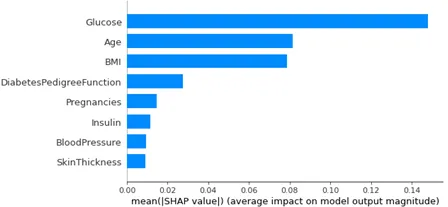
We could quickly train a machine learning model to predict the likelihood of having diabetes by using a classification algorithm. Once this model is created, we could apply SHAP to further understand how the model thinks specific predictors impact the likelihood of diabetes. We could create a bar plot of the mean absolute SHAP values to see a predictor’s average impact.
In this example, a predictor’s mean absolute SHAP value has been plotted on the x-axis while features have been placed on the y-axis. In addition, the features have been ordered by the most significant average absolute SHAP value. We can see that glucose is, by far, the most important predictor, followed by age and BMI, which appear to have relatively the same mean absolute SHAP value. Like in linear regression, we can start seeing the underlying patterns of our data and what aspects of our data are the strongest influence on the outcome.
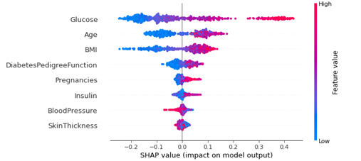
The next step is to dive deeper and see how exactly glucose, age and BMI impact our predictions. We can do this directly through a bee swarm plot.
The SHAP value has been plotted on the x-axis for this bee swarm plot and all features have been placed on the y-axis. Next, all data points were plotted for each feature and color-coded blue if it was a low value for that feature and red for a high value. For example, it can be seen that high values of glucose, age and BMI, all have a very positive impact on increasing the likelihood of diabetes. In addition, since high glucose values typically have a very large positive SHAP value, these are a very strong predictor of diabetes. Interestingly, from the bar chart above, we saw that age and BMI had about the same average impact on predicting diabetes. But here in the bee swarm plot, we can see that for low values of BMI, their SHAP value tends to be lower than that of low values of age. This implies that low values of BMI tend to have a stronger impact on decreasing an individual’s risk of diabetes than low values of age. Now, we can see that by leveraging XAI and machine learning, we are able to really learn some detailed nuances in our data.
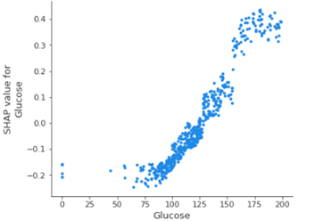
Finally, we want to see exactly how one of these predictors affects our outcome, and we can see from the figures above that glucose is very important. So, to answer our question, we can create a dependence plot as shown below.
Here, the values for glucose are plotted on the x-axis and the SHAP values are plotted on the y-axis. Interestingly, we can see that for a typical glucose value of around 100, the SHAP value is slightly negative, indicating that if your glucose is normal, this is decreasing your chance of having diabetes. It can also be seen that as an individual’s glucose increases, their SHAP value starts drastically increasing until plateauing around a glucose value of 175. In addition, low glucose values will decrease SHAP value until around 40 when the SHAP value starts rising slightly. What is of fundamental interest to note is that the machine learning model naturally learned a nonlinear relationship from our data. This allows us to see relationships that exist in more detail and how we can extract these from machine learning models.
It is also vital to note that this example was based on the open source data set provided by NIDDK, which can be found here (Data Set). This example illustrates how to leverage machine learning and explainable AI to help us uncover trends and patterns in our data.
Take away
By leveraging XAI and machine learning, we can make enormous strides in truly leveraging our data to rationalize complex relationships and interdependencies. Understanding why something is happening allows us to become much more proactive. Machine learning continues to prove itself as a crucial business accelerator tool. When combining machine learning with XAI, we now have another vital asset that allows us to research, understand our data, answer key questions on why certain outcomes are happening, and clearly see into our vast ocean of data.
Explore our life sciences expertise or connect with a CGI expert to discuss how implementing machine learning and XAI can help create valuable insights into your organization’s data, drive critical business decisions and improve patient outcomes.


